The Waveform Model
A natal chart shows where the planets sit — like tiny particles pinned to a wheel. The waveform model shows the same ten planets as waves that ripple and mix into a single field. You need both, the way light is both particle and wave. Here is how the field works, in plain terms — and the tests, including the ones it failed, that tell us exactly how far to trust it.
A Field Note from Scalar Flower. With computational collaboration by the Hermes agent (Nous Research).
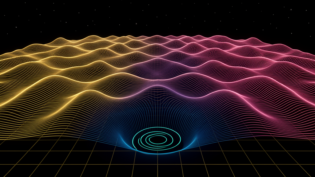
Ten planets, ten waves, one field. Where the waves agree, the field rises into light; where they disagree, it falls into blue; and at the deepest nulls, it spins.
REAL — computed or proven; a number you could rerun and check. ARCH — true structure or definition that follows from the real quantities; correct bookkeeping, not a discovery. INTERP — offered meaning; a lens that makes no prediction and cannot be falsified. REFUTED — a claim we tested and the data killed. We keep these visible on purpose.
Almost everyone has seen a natal chart: a round wheel, cut into twelve slices, with the Sun, Moon, and planets marked at the spots they held on the day you were born. It's a kind of map. It tells you where each planet was. What it doesn't show is what all ten of them add up to together — the single shape they make as a group.
The Scalar Flower started from one plain question: what if we stopped treating each planet as a dot on a wheel, and treated it as a wave instead? Think of ten pebbles dropped into a still pond at the same moment. Each one sends out ripples. Where two ripples meet crest-to-crest, they pile up into a taller wave. Where a crest meets a dip, they flatten each other out. That meeting-and-mixing of ripples has a name in physics: interference.
Do that with the ten planets — one wave each — and you don't get a wheel with dots on it anymore. You get a landscape. High bright ridges where the waves agree. Deep blue valleys where they cancel. And, at the very bottom of the deepest valleys, something stranger that we'll build up to slowly. That landscape is what we call the field. It's the same ten planets your natal chart already shows — just drawn as what they're doing together, instead of only where they sit.
A natal chart shows where the planets sit. The field shows what they build when you let them mix.
ITwo ways to see the same light
Before going further, the most important thing to understand: the field does not replace your chart. It completes it.
Think about light. For a hundred years, physicists argued whether light was made of waves or of tiny particles. The strange answer they finally landed on is that it's both, and it isn't fully either one. In the famous double-slit experiment, shine light through two narrow slits and it spreads out and ripples like a wave, making bands of bright and dark. But look closer and it also arrives in tiny individual specks, like a stream of pellets. Neither picture is the whole story. You need both, and physicists call this complementarity — two descriptions that seem to disagree, yet are both true, and are both needed to see the whole thing.
The Scalar Flower has always had two views, and they line up with light's two natures almost perfectly:
— The original chart is the "particle" view. Like a traditional natal wheel, it tells you where each planet sits — each one a distinct point, pinned to its place, laid out on a grid that makes the positions clear and readable. This is the needle on the dial. Definite. Located. Like light as a stream of specks.
— The waveform terrain is the "wave" view. The same ten planets, but now let loose to ripple and mix, the way light does in the double-slit. You stop asking "where is each one" and start seeing what they make together — the ridges, the valleys, the whirlpools. Spread out. Flowing. Like light as a wave.
Neither is more real than the other. A dot-on-a-wheel can't show you interference; a rippling field can't tell you the Sun is at 15° Leo. They're complementary — each shows exactly what the other leaves out. INTERP
If this pairing feels familiar, it should. It's the same shape as The Copernican Return: the Earth-centered sky you actually stand under, and the Sun-centered map science gives you, aren't enemies — put together, they make a fuller truth than either alone. Wave and particle are that same partnership, one level down. The needle-chart and the terrain are two honest portraits of one sky.
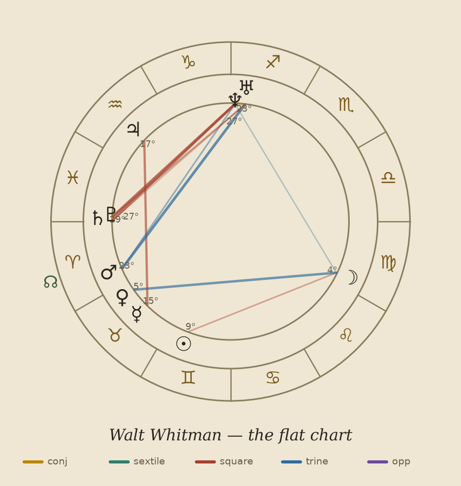
It helps to see the whole journey at once. Here is the same birth moment — Walt Whitman's — drawn three ways, from the chart every astrologer knows, to the field this piece is about:
The flat natal wheel
The chart everyone knows: a circle of twelve signs, each planet marked at its spot. It's clear and exact — it tells you where everything sits. What it can't show is what the ten planets make together.
The 3D Flower-of-Life sphere
Now lift that flat wheel into three dimensions. The same planets, but arranged on a living sphere built from the Flower of Life — twelve spheres gathered around one. The chart stops being a diagram on paper and becomes an object you can turn. Drag it.
The waveform field
Finally, let the ten planets ripple and mix as waves. The dots dissolve into a landscape — gold ridges where the waves agree, blue valleys where they cancel, whirlpools spinning at the valley floors. This is the field the rest of this piece is about. Drag it to turn it.
Same sky, three portraits: where the planets sit, the shape they make, and the field they build. Each one shows what the others can't.
IIThe waves aren't just a picture — they're real math
It's fair to wonder if "the planets are waves" is just a pretty way of talking. It isn't. When we measure how much the ten waves agree, we use the exact same math that physicists use for real waves of light. Not something like it. The identical calculation.
Here's the plain version. Give each planet a little arrow. Lay all ten arrows down one after another, each starting where the last one ended, like ten steps in a walk. Then measure how far you've traveled from your starting point. If the planets mostly "agree," the arrows point the same way and you end up far from home — a long total. If they pull in all directions, they mostly cancel and you end up back near where you started — a short total. That single number — how far the walk lands from home — is what we call the hub. It's the field's togetherness. A high hub is a chart with one strong, clear voice; a low hub is a chart pulling many ways at once.
For readers who like the formula, here it is — and the only reason to show it is that it's literally the physics-textbook formula for light waves adding up:
You don't have to read the symbols. The point is just this: when we say the hub measures interference, we're not borrowing a poetic image from physics. We're using physics' own equation. REAL
IIIThis is where regular astrology's "aspects" come back
If you've had a chart read, you've heard about aspects — the angles between two planets. A trine (120°) is called easy; a square (90°); an opposition (180°). Traditional astrology has always treated these angles as the heart of a reading.
Here's the surprise: when you work out how the waves add up, those same aspect angles fall right out of the math on their own. We didn't put them in. Each classic aspect turns out to "light up" one layer of the field:
— the opposition (180°) and conjunction (0°) → the 2-fold layer;
— the trine (120°) → the 3-fold layer;
— the square (90°) → the 4-fold layer;
— the sextile (60°) → the 6-fold layer.
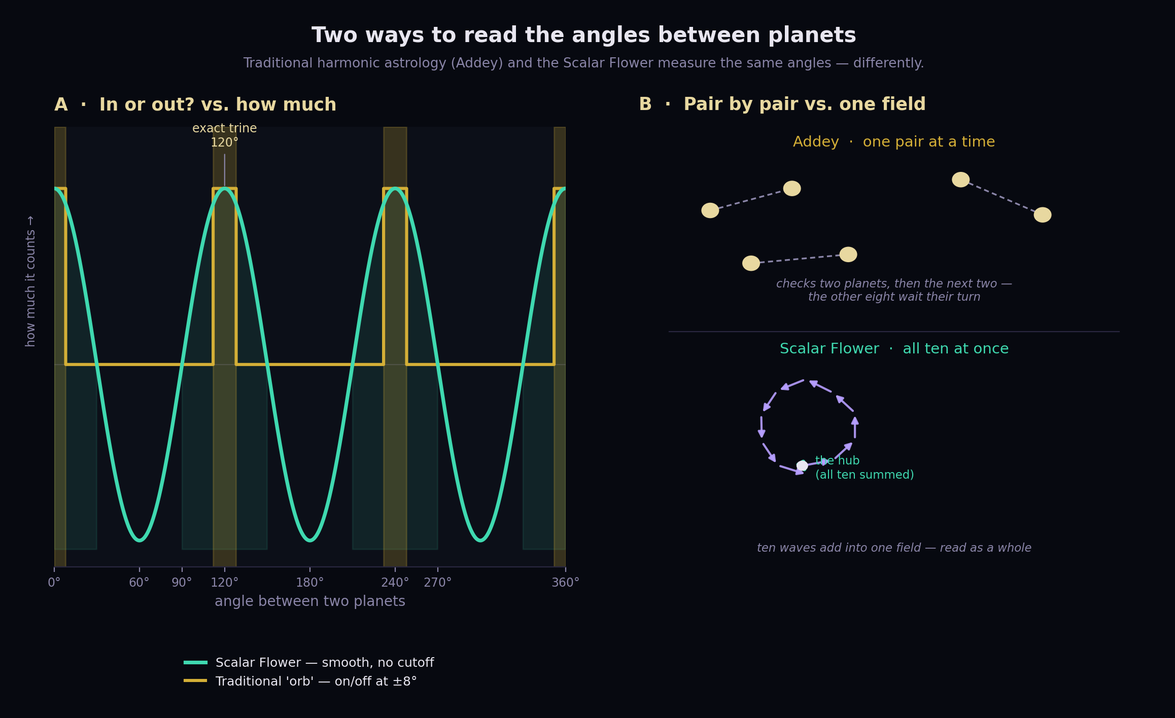
So the aspects your astrologer already uses aren't something separate from this model. They are this model, seen one layer at a time. And our version is a little cleaner: traditional astrology has to argue about "orbs" — how many degrees off a square can be and still count. Here there's no cutoff and no argument. An angle contributes exactly as much as it's worth, on a smooth sliding scale, and we read the whole ten-planet pattern at once instead of one pair at a time. The tradition was right to care about aspects all along. It just never had the equation underneath them. ARCH
IVThe first test: does it stay the same when you redraw it?
Before trusting anything you read off this field, it has to pass one hard test. A birth chart can be drawn in different styles — the Western (tropical) zodiac or the Vedic (sidereal) one, one house system or another. These are just different ways of drawing the same sky. If your "field" changed every time you switched drawing styles, then you were never measuring the sky at all. You were only measuring your choice of graph paper.
So we checked. Switching from one zodiac to the other simply shifts every planet by the same amount — it turns the whole picture like a lazy Susan, without changing the shape sitting on it. And turning the picture can't change how far our ten-step walk lands from home. When we ran it both ways, the numbers didn't budge:
That's what earns a number our top trust-tag: not that it looks impressive, but that it comes out the same no matter how you draw the chart. The ridges and valleys you turn on screen aren't a trick of our settings. They're really there. REAL
VThe tests it failed — and why we put them front and center
This is the part where most systems get quiet. We won't, because the failures are exactly what make the rest trustworthy.
The waveform idea is tempting in a dangerous way. Once you picture planets as waves, it's a short hop to believing they must be real physical waves — that Mars is actually broadcasting something that travels to Earth and mixes with a signal from Jupiter, and that this is why a chart means anything. That's a claim you can actually test. So we did — twice, with the pass-or-fail rules written down in advance so we couldn't move the goalposts later.
Test 12 — the "music of the spheres." The old dream that the planets' orbits form clean musical ratios, like notes in a chord. If that were true, the solar system would ring like an instrument. We checked.
Test 15 — the direct one. Do the planets actually send out waves that reach Earth and interfere here, the way the model imagines? We measured every path we could.
The planets are not beaming waves at us. We built an instrument sensitive enough to catch the faintest real signal, pointed it at the sky, and heard nothing.
This is the rule the whole project runs on — the same one behind Six Times We Went Looking for the Sky in a Person and written up test by test in The Verdict Ledger. A system that only shows off its wins isn't worth trusting. So here's the honest bottom line, and it matters: the field is real as a piece of mathematics; it is not a claim that the planets are pushing on us. The waves are a powerful way of seeing. They are not, as far as we can tell, a force. ARCH
VIThe blue valleys, and the whirlpools at their floor
Now for the strangest and most beautiful part of the field: the deep blue valleys where the ten waves cancel out, and the tiny whirlpools that sit at the very bottom of them.
First, a word worth retiring: "destructive." Where waves cancel, nothing is actually destroyed. This isn't wishful thinking — it's basic physics. In any wave pattern, the total energy is always conserved. The brightness that seems "missing" from a dark valley hasn't vanished; it's been pushed over into the bright ridges nearby. Add up the whole field and it always balances. "Destructive interference" only describes a local patch of quiet, and the word has fooled people for two hundred years into hearing "wiped out." A truer word is moved. The valley doesn't lose anything. It hands it off. REAL
Now, the whirlpools — and to explain them, we first have to be clear about one word, because it's easy to get wrong (and I got it slightly wrong myself the first time I tried to describe it).
With that in hand, here's what a whirlpool — a vortex — actually is. It's a very special spot where two things happen at once: the wave cancels all the way to flat zero — the deepest a valley can possibly go — and, if you walk in a small circle around that spot, the clock hand (the phase) sweeps through one full turn. The field spins around a dead-still center, like water circling a drain. REAL
And here's the part that turns the picture inside out. You'd think the valley comes first and the whirlpool is just its lowest point. It's the other way around. At a spot where the wave is perfectly flat — zero height — there's no crest and no trough, so "where in the cycle" has no answer at all. The clock hand has nothing to point at. Nature's only way to handle a point where the answer is undefined is to make every path around it sweep a full turn. So the field is forced to dig all the way to zero and spin there. The cancellation digs the valley; the whirlpool is the still eye the whole valley wraps around. ARCH
The valley is where the field goes quiet. The whirlpool is the still eye it turns around — because at dead zero, there's no "where in the cycle" left, so the field can only circle it.
VIIThey always come in pairs — and that's a law
Turn the field and you'll see the whirlpools are marked in two colors — teal for one spin direction, red for the other. They're never alone. A clockwise whirlpool is always born together with a counter-clockwise one, and the two can only cancel out together, never one by itself. This isn't a design choice in the software. It's a mathematical law, the same kind as the old rule that you can't comb a hairy ball flat without leaving at least one cowlick. On a sphere, the spins always have to balance to zero.
We confirmed it by counting: as we measure more and more finely, the spins cancel to exactly zero on virtually every chart. REAL
Two simple rules govern how many whirlpools a chart has. The more "together" a chart is, the fewer whirlpools — a strong, focused field is calm; a scattered one churns with them. And pushing a field toward one strong direction makes the whirlpools cancel off in pairs — we've watched a field go from more than ninety pairs down to a handful, the spins balancing to zero the whole way down. That full measurement is its own piece — The Paired Vortices of the Birth Field — and the whirlpool count turns out to say something real about a chart that the togetherness number alone doesn't. REAL
VIIIIs it like a black hole? A real echo, kept honest
It's natural to wonder if this is a kind of black hole. The honest answer is: it genuinely rhymes with one — and the exact place where the rhyme stops is worth being careful about.
What our whirlpool truly shares with a black hole is real, not surface-level. A still center that everything circles around: yes. A spot where the ordinary, flat way of describing things breaks down: yes. And a kind of "spin charge" that can only be created or cancelled in balanced pairs: genuinely yes — a deep pattern that shows up again and again across physics, from a wave on a sphere to the giants at the centers of galaxies. ARCH
What it does not share is the cause. A black hole is a pit in space and time itself — mass so dense it bends the fabric of the universe, with gravity and an edge you can't return from. Our whirlpool is a still point in a pattern of waves. The same word, "singularity," gets used for both, but they're doing very different jobs. So a black hole isn't what this is. It's what this is like — the same shape (a still center, the flat picture breaking down, nothing actually lost) showing up at wildly different sizes. INTERP
Called a fact — "these are black holes" — it would be the project at its worst. Held as an echo, it's one of the truer things: the same shape repeating from the smallest wave to the heart of a galaxy. We name the resemblance. We don't pretend it's the same thing.
IXWhere the field goes when it disappears
There's one last thing to say about the whirlpool, and it's the deepest. When you first watch the field turn, it's tempting to ask: when the wave cancels to nothing, where did it go? Does it drop out of view and then come back? That instinct is closer to right than it sounds.
At the whirlpool, the wave's height falls to zero. In the picture we draw — height above the ground — the field has simply disappeared. But it hasn't gone anywhere. It's been carried into the one thing the height-picture ignores: the phase, that clock-hand position from the box above. That's the whole reason the field has to spin around the dead point — the height is gone, so the only thing left to hold the field's information is which way the clock hand is turning. Turn the planets, and the wave rises right back up into view. It was never lost. It was held, safe and recoverable, in the part of the picture the flat view can't see. REAL
And this is the same lesson as The Copernican Return: the flat, outside, "view from nowhere" throws away the information you only get by standing somewhere — and the moment you stand somewhere, it all comes flooding back. The whirlpool is that idea made physical. What the flat picture drops isn't destroyed. It's kept in the turning, and it returns the moment you move. ARCH
Here is a place to step, on purpose and with the label showing, onto more speculative ground — because the idea is worth naming honestly rather than skipping.
What the math actually shows is this: a field can go dark in the part you can see while keeping everything, safe and recoverable, in a part you can't — and then bring it back. That is very close to the shape described by an older line of frontier physics — the work of Nikolai Kozyrev, Konstantin Meyl, and the scalar-potential tradition — which pictures a hidden kind of potential that can slip out of the ordinary electric-and-magnetic world and be called back into it, nothing lost, only stored out of sight for a while.
Our instrument does not prove any of that — and the failed tests above are exactly why we won't claim it does. What can be said plainly, because the resemblance is too clean to ignore, is that the waveform model gives a simple, checkable picture of the pattern those theories are built on: vanish without loss, keep it hidden, bring it back. Whether that hidden store is really a physical scalar potential is an open question at the edge of physics, and we leave it open. A resemblance worth pointing at — never a mechanism we've measured. INTERP
That's the whole discipline in one snapshot. What's REAL: the field, the physics equation behind the hub, the fact that it doesn't change when you redraw the chart, the whirlpools and their pairing, and the way the field is stored and returns. What's REFUTED: the idea that planets beam physical waves at us. What's INTERP: the black-hole echo and the scalar-potential idea offered on the far shore. Three levels, kept clearly apart — so we can go all the way into the beauty of this without a single claim we'd have to take back later.
The waveform is a true and powerful way of seeing. It is not a force in the sky. Keeping those two straight is the most valuable thing we've built.
Turn the field with your own hands
Cast your own birth-moment as a living interference field — free, no sign-up. Watch the peaks gather, the valleys open, and the whirlpools turn at their floor.
Cast your field, free →